00:00 — Introduction
Hello everyone, in this tutorial we're going to be creating a clustered bar chart like you see here.
All right, let's get into it.
00:07 — Setting Up ChartBuddy
Open up a new slide and then open up ChartBuddy. I'm going to assume you already have it installed.
By default, ChartBuddy doesn't open up a clustered bar chart, so go to the menu on the right and click Clustered Bar Chart.
For now, we close the data window, position the chart in the right location, and make it the right size.
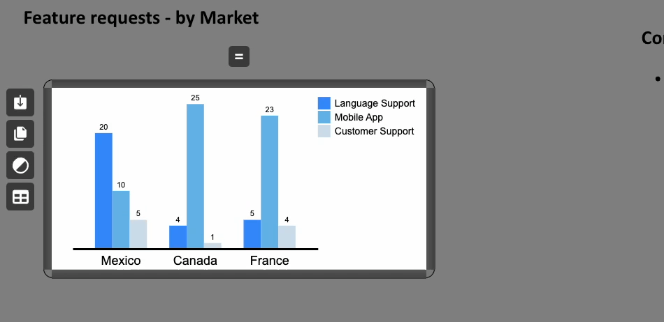
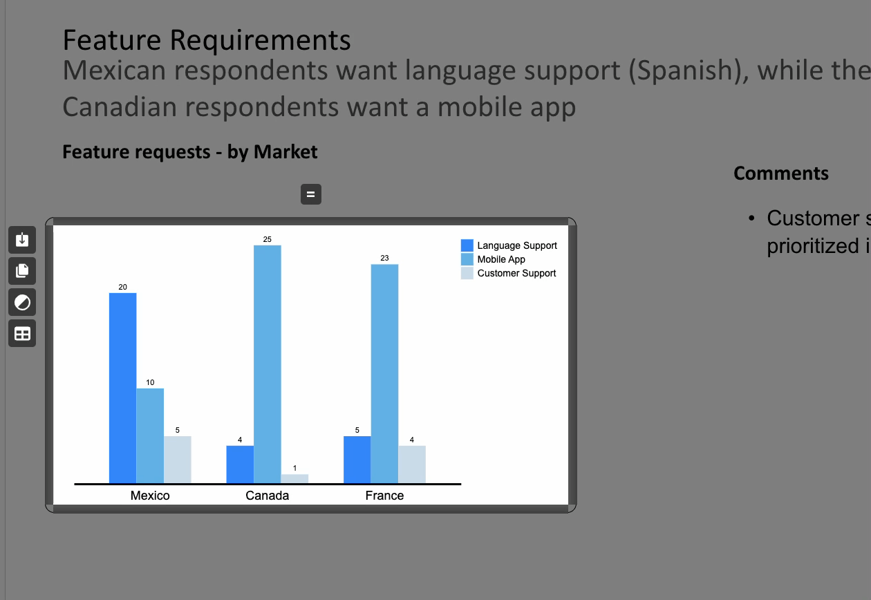
00:38 — Entering Data
Open up the data window with the button on the left. I've prepared the data in a separate tab.
You can easily copy and paste the data from any spreadsheet app into the ChartBuddy editor.
00:52
Note that the labels on the top row correspond to the labels on the x-axis. Let's remove the placeholder data.
The labels in the first column correspond to those in the legend.
01:06 — Legend
Next, let’s put the legend in the right location.
We can grab it and place it in one of the pre-specified docking locations. In this case, I’ll put it below the title.
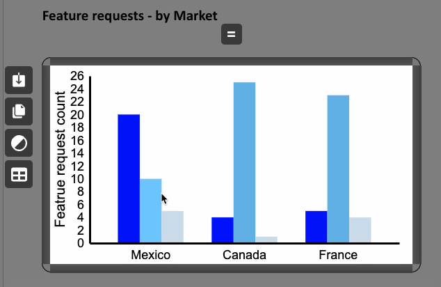
01:17 — Changing Series Colors
To change the color of a series, right-click one of the legend tiles.
Then, click the currently selected color to make the color picker show up.
You can also use pre-selected colors, which you can define in the menu.
- Let’s use blue, red, and green for this example.
01:44 — Editing Title and Font Size
Next, we're going to change the title.
Double-click it to edit the text, and let’s also adjust the font size.
02:00 — Adjusting Y-Axis Intervals
We will now change the interval of the y-axis.
Right-click one of the labels, then use the dropdown under Tick Interval and set it to 20.
02:13 — Removing Axis Titles
Next, we’re going to remove the axis titles.
To remove a title, double-click it and press delete to delete all the text.
This will automatically remove the text field for the title.
02:27
Right-click the axis label and make the font a little larger.
02:34 — Cleaning Up the Chart
Now, let’s clean up the chart.
Right-click the axis and press Hide Tick Marks.
This removes the tick marks on the y-axis for a cleaner look.
02:49
If we want to go further, we can right-click the background and press Hide Y-Axis to hide the y-axis altogether.
02:56 — Inserting the Chart into Google Slides
Next, we’ll insert it into Google Slides.
One option is to download the chart, but we won’t do that now.
The button next to the download button is the Copy button, which copies it to the clipboard.
Actually, we don’t need to do that either. Simply double-click anywhere on the transparent overlay, and the chart will automatically be added to the clipboard.
03:21
You can then press Ctrl+V (or Command+V on Mac) to insert the chart.
03:30 — Conclusion
And that’s it! We’ve now created our first clustered bar chart.