Histogram vs. Bar Graph: Understanding the Differences and Choosing the Right One
Bar graphs and histograms look similar but serve completely different purposes. Confusing them can lead to misleading visualizations and misinterpreted data. This guide clarifies the key differences and shows you exactly when to use each type - with practical examples and visual comparisons.
Understanding these distinctions isn't just academic - choosing the wrong chart type can fundamentally alter how your audience interprets your message. By the end of this guide, you'll confidently select the right visualization every time.
In This Guide:
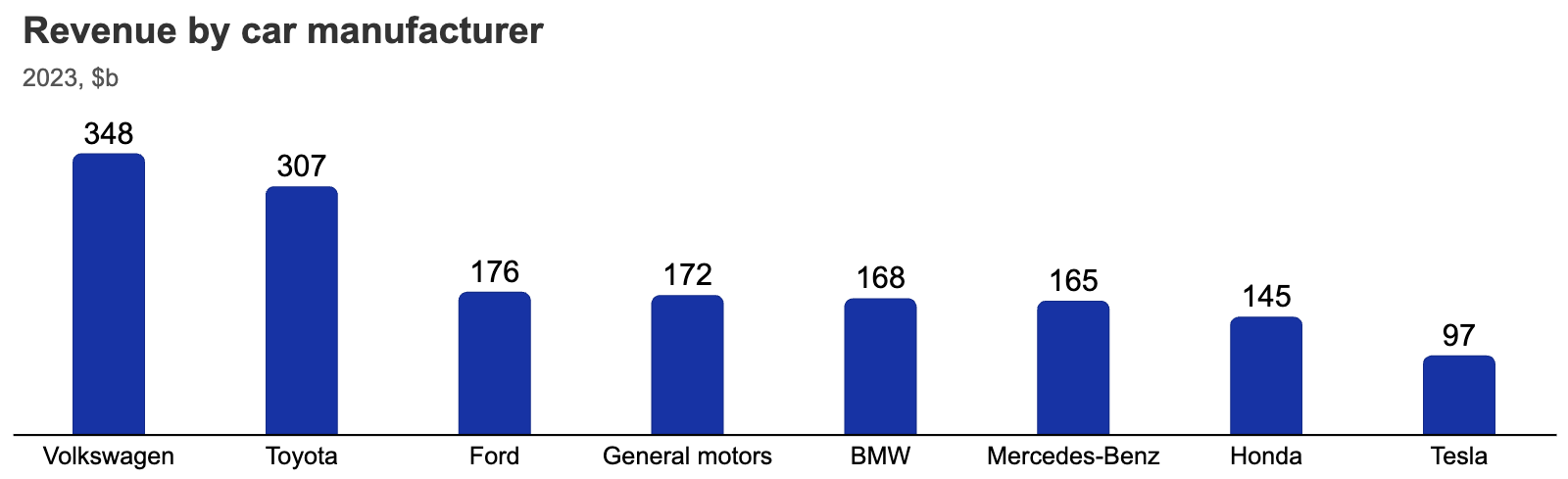
What is a Bar Graph?
A bar graph (or bar chart) displays categorical data using rectangular bars. Each bar represents a distinct category, and its height (or width) shows the value for that category. The spaces between bars emphasize that categories are separate and unrelated.
Key Characteristics of Bar Graphs
Categorical Data
Shows discrete categories like product types, regions, or demographic groups. Each category is independent.
Separated Bars
Spaces between bars visually communicate that categories are distinct and don't form a continuous sequence.
Flexible Orientation
Can be vertical (column chart) or horizontal. Horizontal works better for long category names.
Flexible Metrics
Values can represent frequency, percentage, revenue, or any measurable metric relevant to your categories.
What is a Histogram?
A histogram displays continuous numerical data by grouping values into ranges (called bins) and showing how frequently values fall into each range. Unlike bar graphs, histograms reveal patterns, distributions, and outliers in your dataset.
Key Characteristics of Histograms
Continuous Data
Displays numerical data that can take any value within a range (temperature, weight, age, time).
Touching Bars
Bars have no spaces between them, visually representing the continuous nature of the data.
Distribution Focus
Shows how data is distributed across a range, revealing patterns like normal distribution or skewness.
Uses Bins
Groups data into intervals (e.g., ages 0-10, 11-20). Bin size significantly affects the visualization.
Key Differences: Bar Graph vs Histogram
Although both use bars to represent data, bar graphs and histograms have fundamental differences that affect when and how you should use them:
| Feature | Bar Graph | Histogram |
|---|---|---|
| Data Type | Categorical | Numerical (Continuous) |
| Bar Spacing | Bars are separated | Bars touch each other |
| X-Axis | Categories (e.g., brands, countries) | Intervals (e.g., age ranges) |
| Purpose | Compare different groups | Show data distribution |
| Example Use | Comparing sales of different products | Analyzing test score distributions |
When to Use a Bar Graph
Choosing the right visualization isn't just preference - it's critical for accurate interpretation. Data visualization experts maintain strict guidelines because the wrong choice can lead to misleading conclusions.
Use a Bar Graph When:
- You want to compare distinct categories (not continuous ranges)
- Your data represents qualitative variables (brand names, countries, customer types)
- You need a chart that's easy to interpret for a broad audience
- You're highlighting differences between unrelated groups rather than showing a continuous spectrum
Example: Comparing Car Manufacturer Revenue
If you want to compare the revenue of five different car manufacturers, a bar graph is the perfect choice. Each manufacturer is a separate category with no inherent relationship to the others, making separated bars the ideal visual representation.
Best Practices for Bar Graphs
Clear Labels
Use concise X-axis labels. For lengthy labels, switch to horizontal orientation.
Limit Categories
Aim for 6-8 categories maximum to avoid clutter and maintain readability.
Contrasting Colors
Use distinct colors for different categories. Check our guide on color use.
Logical Sorting
Arrange bars by value (ascending/descending) or logical category order for easier comparison.
When to Use a Histogram
Use a Histogram When:
- You're analyzing data distribution rather than comparing individual values
- Your data is continuous numerical (age, temperature, income, time)
- You need to identify patterns like normal distribution, skewness, or outliers
- You want to reveal the underlying shape and characteristics of your dataset
Example: Tree Height Distribution
A histogram is ideal for analyzing the height distribution of pine and oak trees in a forest. By grouping tree heights into intervals, you can easily compare distributions and identify patterns - like whether oak trees tend to be taller than pine trees, or if height distributions are similar.
Best Practices for Histograms
Choose Appropriate Bin Sizes
Too many bins create fragmentation; too few oversimplify. Experiment to find the right balance.
Ensure Bars Touch
Histogram bars should have no gaps to reflect continuous data. Set bar distance to zero.
Label Ranges Clearly
Draw bars between X-axis labels to show ranges visually. Use labels like "0-10" if needed.
Highlight Trends
Use shading, color, or annotations to emphasize peaks, gaps, or outliers.
Maintain Consistent Scale
Y-axis should start at zero with equal intervals to ensure accurate visual representation.
Frequently Asked Questions
Is it wrong to use a bar graph to display numerical ranges?
While not technically "wrong," it's suboptimal and can lead to misinterpretation. The issue is clarity, not correctness.
Bar graphs include spaces between bars that visually communicate categorical separation. When applied to continuous numerical data, these spaces contradict the continuous nature of the data. For example, displaying income brackets like "$0-$25K" and "$25K-$50K" with separated bars suggests these are entirely different groups, when in reality someone earning $24,999 is much closer to someone earning $25,001 than the visual spacing implies.
Data visualization has established conventions that experienced readers expect. When they see separated bars, they interpret categorical data. Breaking this convention creates unnecessary cognitive friction.
Bottom line: Use histograms for numerical ranges. If you must use a bar graph, clearly label your deviation from convention with explicit annotations.
What are other options for comparing distributions?
When comparing multiple distributions, several visualization options exist beyond histograms:
Violin Plots
Combine box plots and density plots, showing both summary statistics and distribution shapes.
Density Plots
Smoothed versions of histograms showing probability density.
Box Plots
Compact summaries showing median, quartiles, and outliers.
Overlaid Histograms
Semi-transparent overlapping histograms for 2-3 distributions.
Choose based on context: For 2-3 distributions use overlaid histograms or density plots; for many distributions use box plots; for complex shapes use violin plots.
How do I choose the right bin size for a histogram?
Bin size significantly impacts how your histogram looks and what patterns it reveals. There's no single "correct" bin size - it depends on your data and goals.
Too few bins: Oversimplifies the data, hiding important patterns and variations.
Too many bins: Creates noise and makes it hard to see the overall distribution shape.
Just right: Reveals the true shape of your data while remaining easy to interpret.
Rules of thumb: The square root of your sample size is a common starting point (e.g., 100 data points = ~10 bins). Sturges' formula and the Freedman-Diaconis rule are more sophisticated approaches.
Best practice: Experiment with different bin sizes and choose the one that best reveals the story in your data without overfitting noise.
What about stacked and grouped bar charts?
Stacked and grouped bar charts are variations of bar graphs that allow you to show additional dimensions of categorical data:
Stacked Bar Charts
Segments within each bar show sub-categories. Good for showing part-to-whole relationships and total values.
Grouped Bar Charts
Bars placed side by side for each category. Better for comparing individual values across sub-categories.
Both remain categorical visualizations - they're still bar graphs, just with added complexity. Don't confuse them with histograms.
Why do some histograms have gaps between bars?
If you see gaps in what's labeled as a histogram, it's likely one of these situations:
- Software default: Some tools add gaps by default. In Excel and Google Sheets, set "gap width" to 0%.
- Empty bins: No data points fell into certain ranges. This is legitimate and reveals important information about your data.
- Misclassified chart: It might actually be a bar graph mislabeled as a histogram.
- Discrete data: When showing counts of discrete integers, small gaps can help distinguish individual values.
For true continuous data, histogram bars should touch unless there are genuinely empty bins in your data range.
Create Professional Charts in Seconds
Whether you need bar graphs, histograms, or advanced chart types, Chartbuddy makes it easy to create publication-ready visualizations directly in Google Slides.
Install Chartbuddy FreeFree to use, no sign-up required