Ask any FP&A team where their time spent on monthly reporting actually goes, and the answer is almost never "analysis." It is the formatting. The rebuilding. The pixel-pushing. Getting the charts to look right in the deck, again, for the third month in a row.
The last mile of the FP&A reporting process is where time goes to die. The numbers are in, the analysis is done, and now you are staring at last month's deck trying to remember which chart links to which sheet, what you manually adjusted, and why that one waterfall bar is the wrong color again.
We built Chartbuddy to automate that loop. It is recurring reporting software for Google Slides: build your report once, link every chart to your Google Sheets data, and let it update when the data does. No copy-pasting, no reformatting. It automates charts in your presentation so your time goes back to analysis, where it belongs.
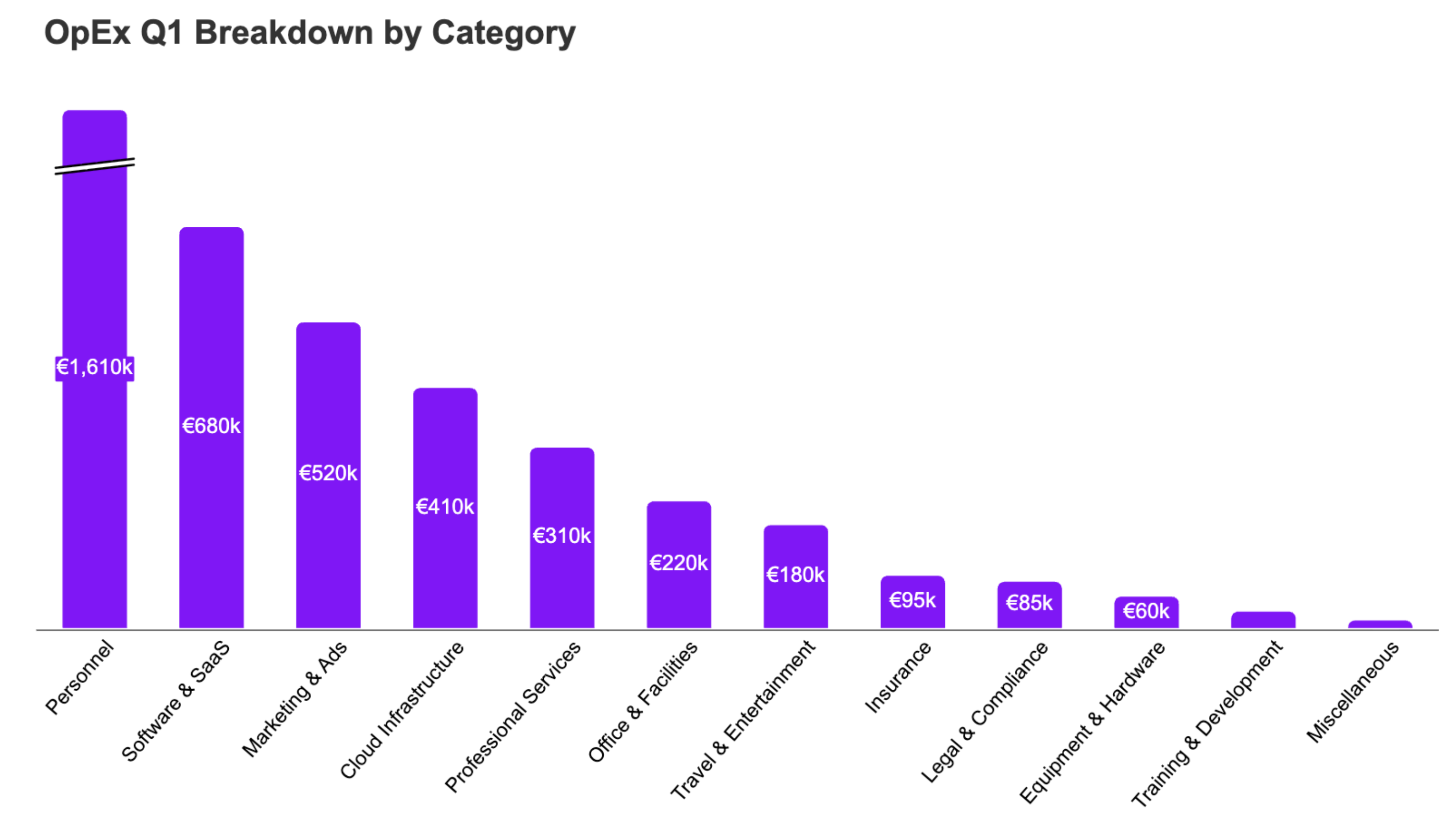
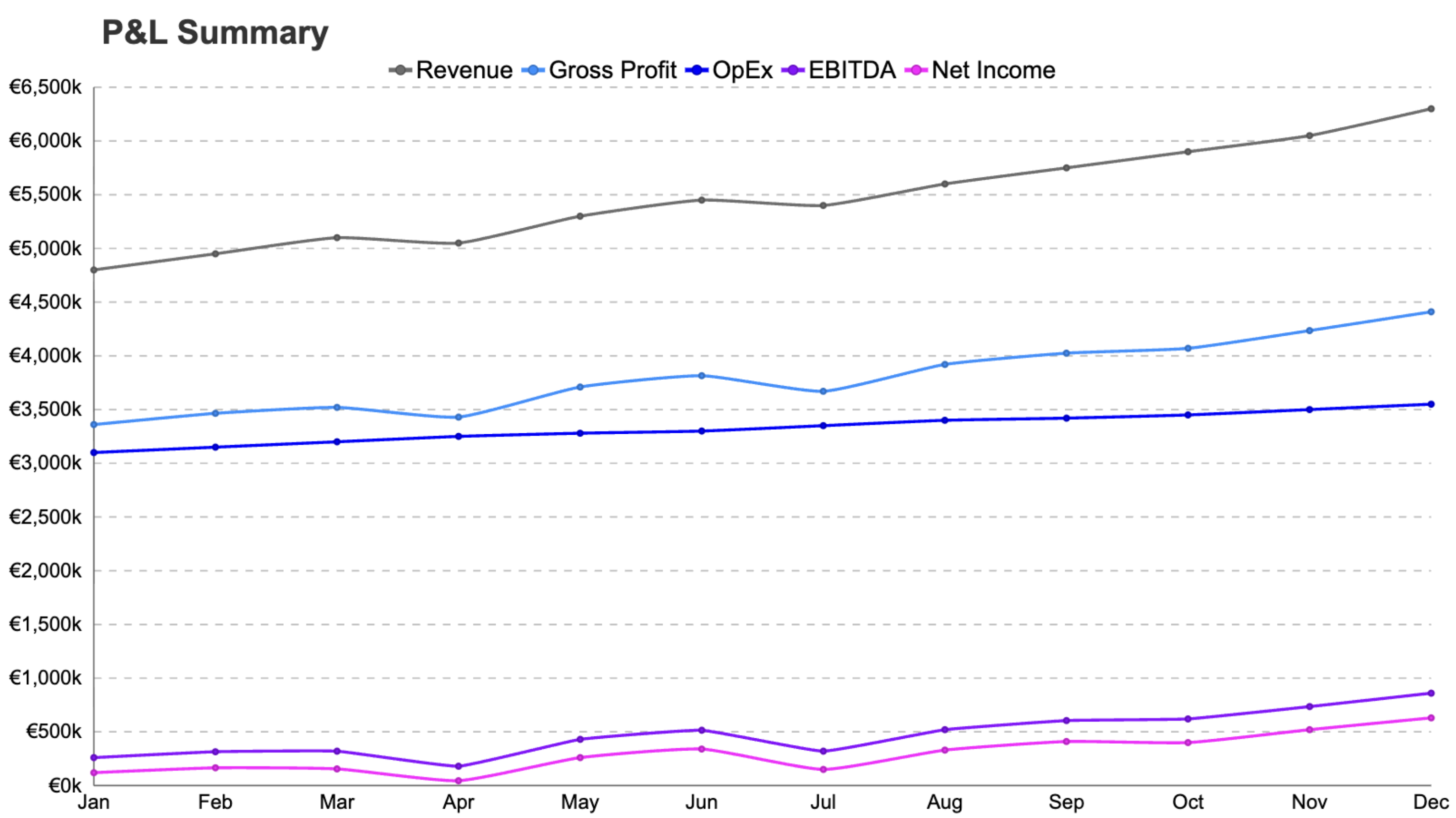
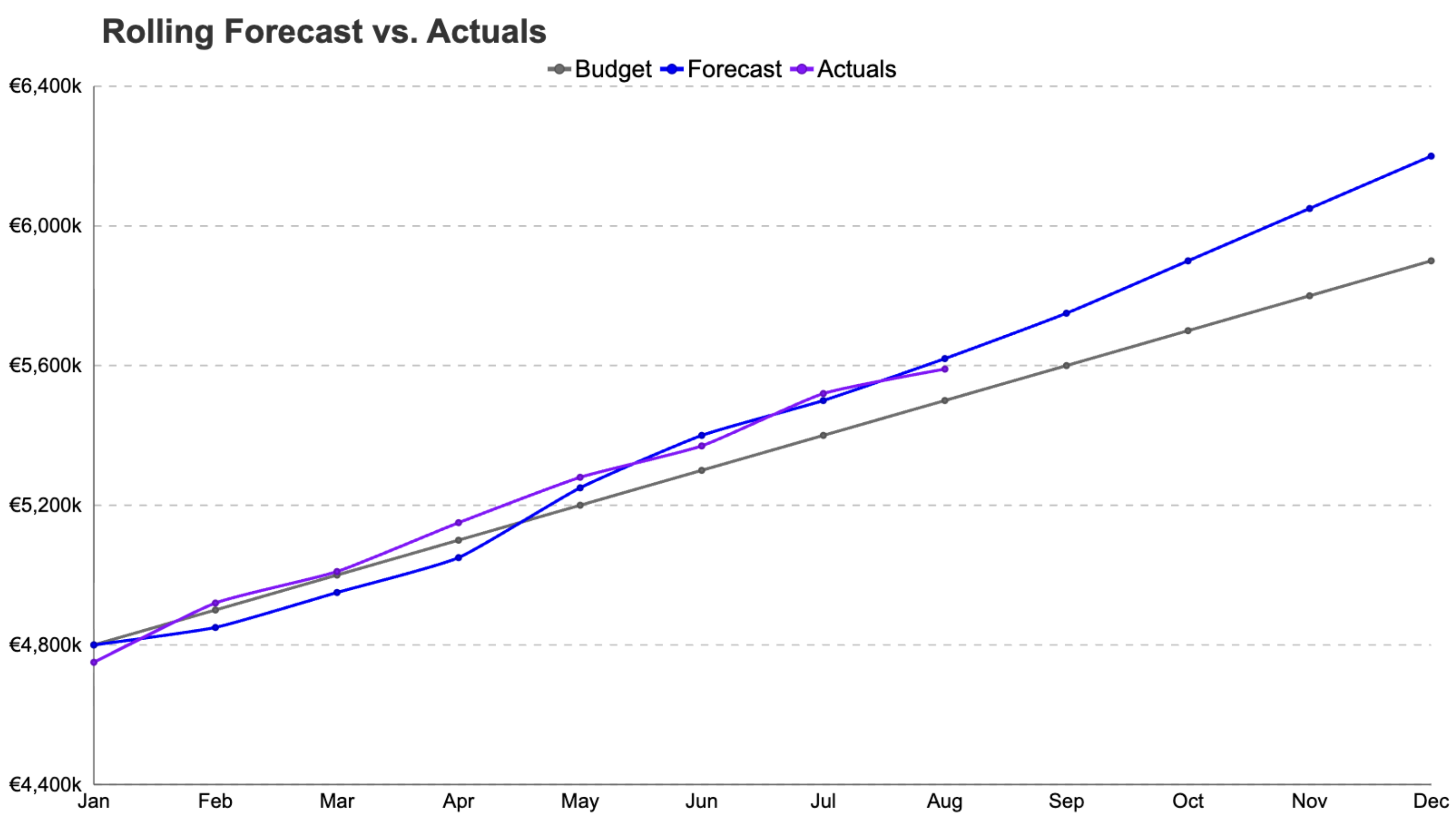
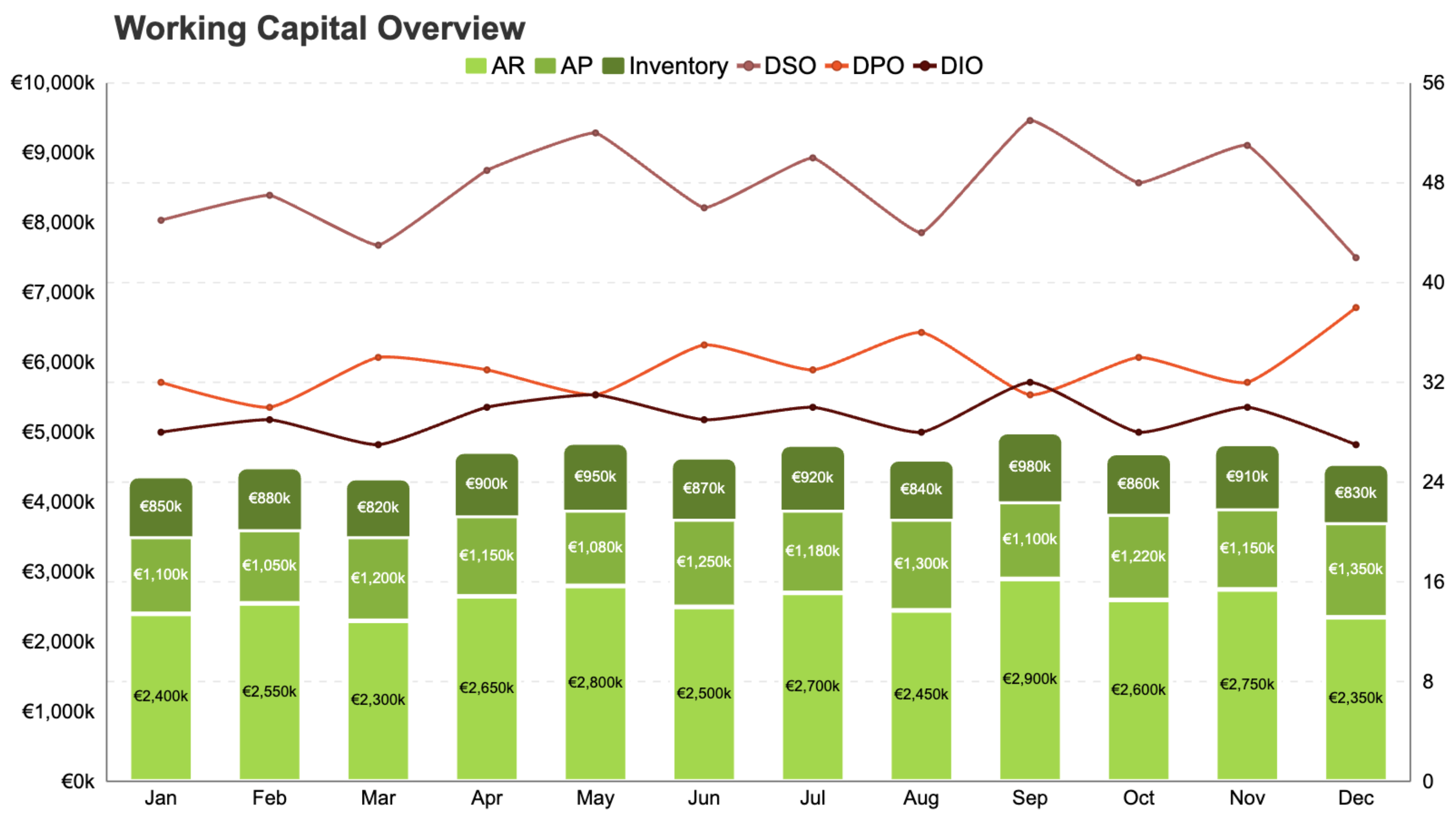
But a tool is only half the story. To actually help, we put together a set of monthly analyses that we think belong in most FP&A reporting cycles, regardless of industry. For each one, we have built a chart template inside Chartbuddy. When you create a new chart, just pick the template, connect your data, and you are off.
Here is what we suggest reporting on every month, and why.