Chartbuddy gives you full control over chart colors and lets you set organization-wide defaults so every chart matches your brand.
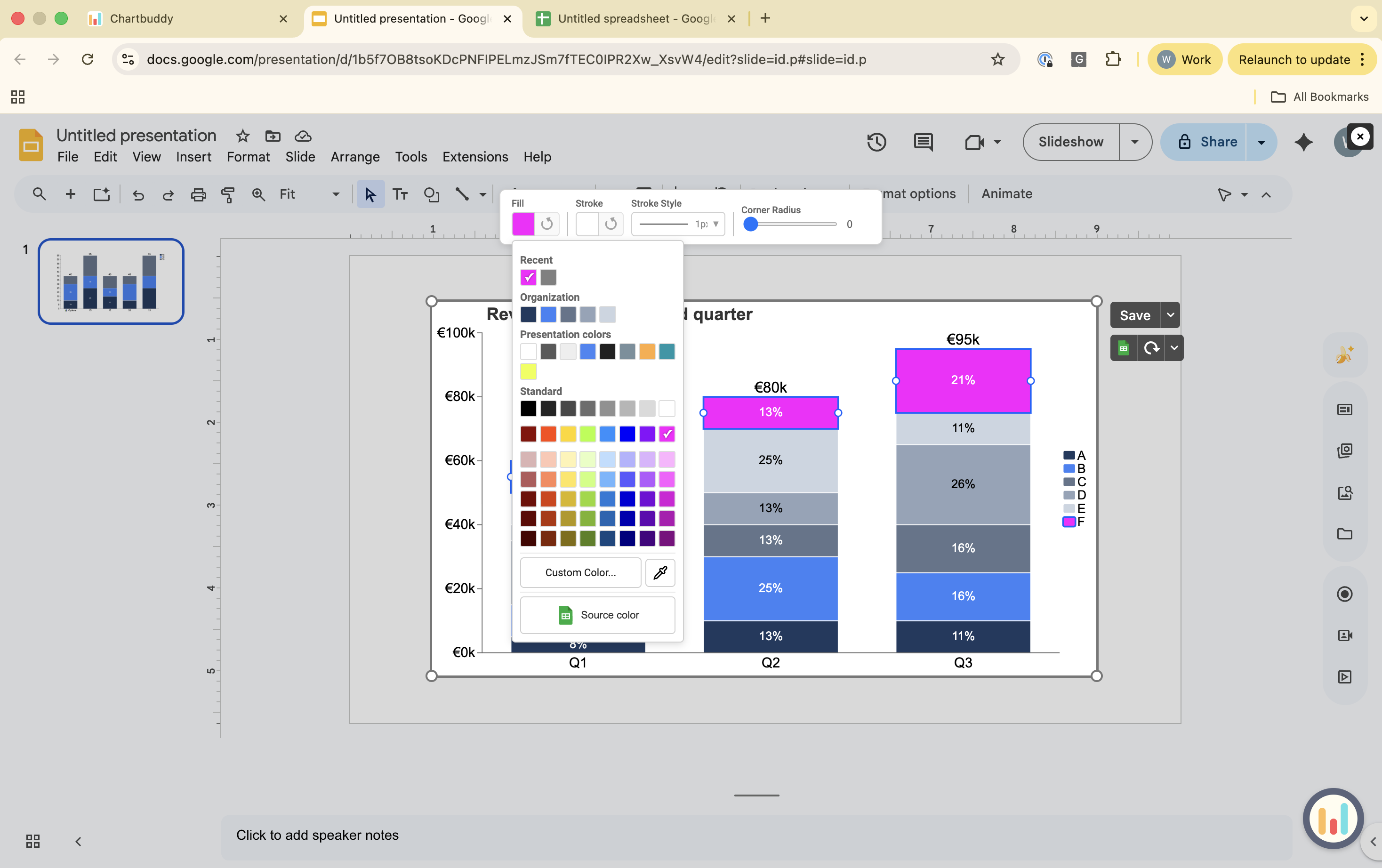
Changing colors on a chart
- Click on an individual segment to change its color, or press Ctrl/Cmd+A to select an entire series
- Open the color settings
- Choose from four options:
- Presentation native colors (from your Google Slides theme)
- Your company standard colors (set during initial setup or in settings)
- A color from the built-in palette
- The eyedropper tool to pick any color from your screen
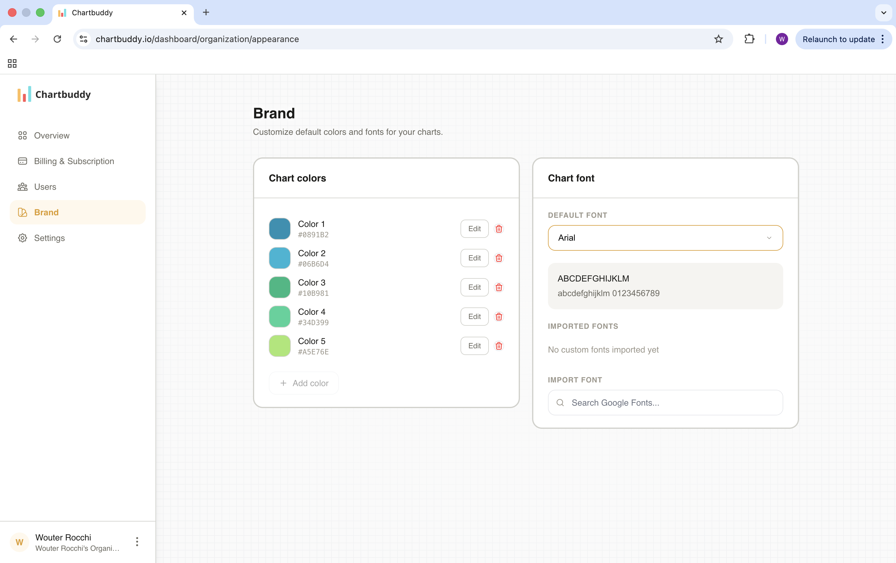
Setting your brand theme
You set your default brand colors and font during the initial setup flow after installing Chartbuddy. You can update them anytime:
- Open Chartbuddy settings
- Go to the brand / theme section
- Enter your brand colors
- Select your default font
- Save
Every new chart you create will use these defaults automatically. Existing charts are not affected - you can update them individually or keep them as they are.
Tips
- Set your brand theme once, and every team member who installs Chartbuddy can use the same defaults
- You can override brand colors on any individual chart without changing the global settings