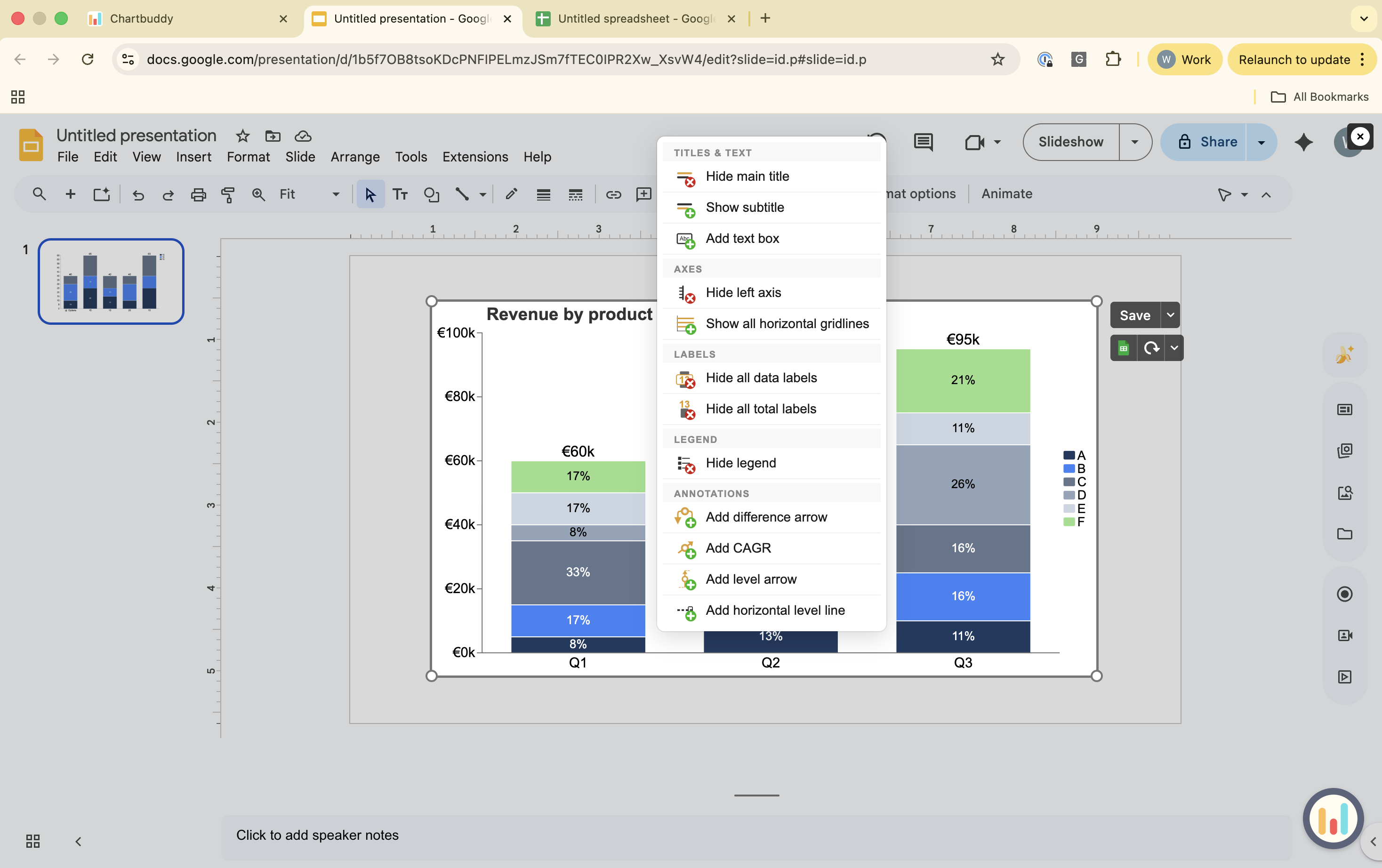
Chartbuddy uses two interactions: right-click to add, left-click to select and format.
Adding elements
Right-click on the chart to open the menu. From here you can add:
- Title
- Subtitle
- Text box
- Axis
- Gridlines
- Data labels
- Total labels
- Legend
- Difference arrow
- CAGR indicator
- Level arrow
- Level line
Right-click on an axis to open the axis menu. From here you can add:
- Tickmarks
- Axis break
- Axis title
- Axis labels
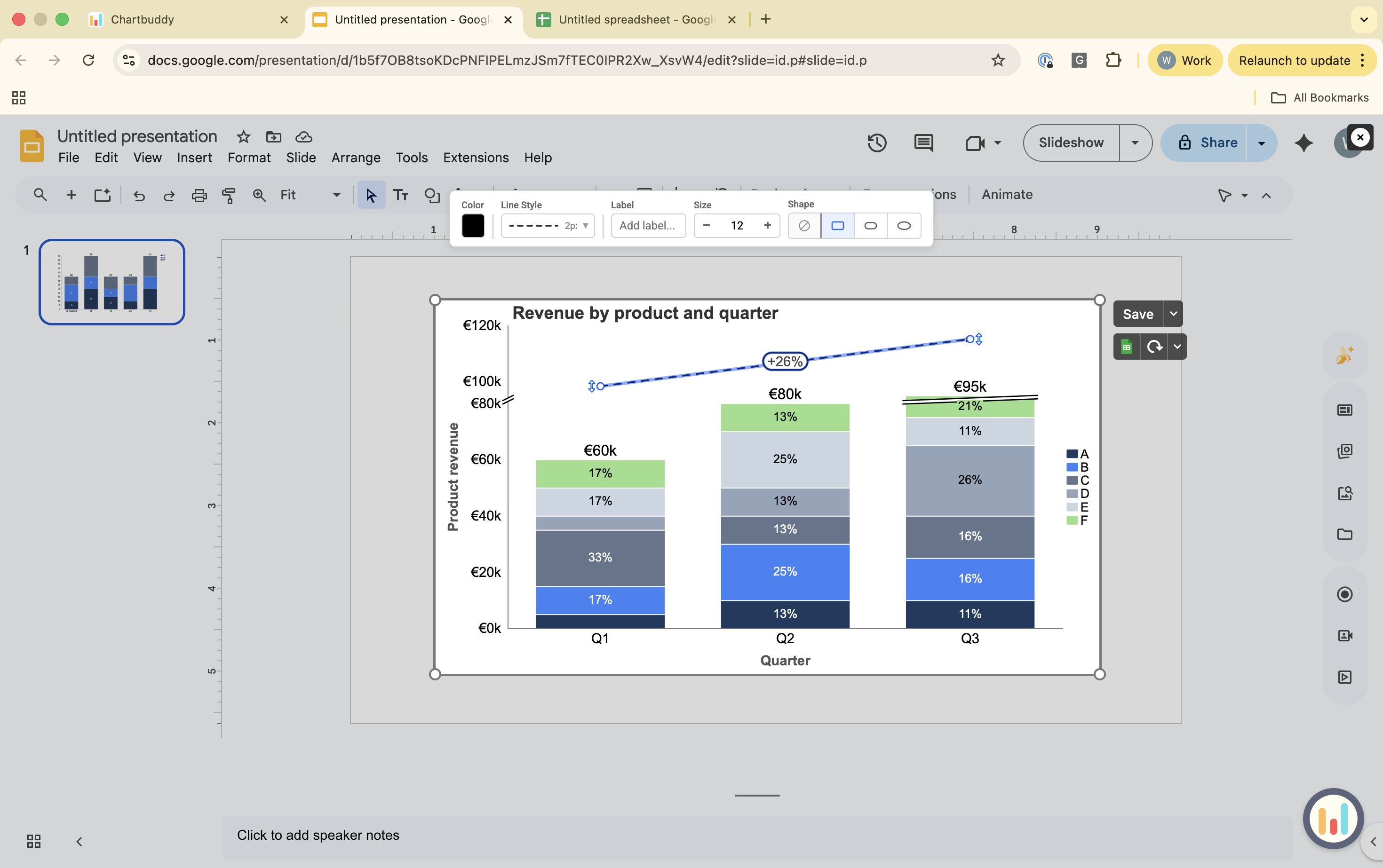
After an element is on the chart, left-click to select it and use the top bar to format it.
Formatting elements
Left-click on any element to select it. If you want to select multiple segments, data series, or labels (e.g., example data labels, total labels, axis labels) use Ctrl/Cmd+A, or hold Shift or Ctrl/Cmd while clicking elements with your mouse. Once selected, use the top bar to format. Available options depend on the element, but include:
- Font, font size, font color
- Color, lining and style
- Positioning
For labels (e.g., data labels, total labels, axis labels), the top bar also includes:
- Prefix and postfix
- Value (e.g., absolute, percentage etc.)
For an axis there are intuitive, in-screen buttons to toggle the axis length and interval.
Keyboard shortcuts
- Ctrl/Cmd+A - select all elements in the current scope (for example all segments in a series)
- Shift-click or Ctrl/Cmd-click - add to or adjust the selection when clicking elements
- Ctrl/Cmd+Z - undo last action
- Ctrl/Cmd+Y - redo last action
- Delete - remove selected element