At Chartbuddy, we frequently hear from content marketers about their unique challenge when creating charts: how to make data both scientifically accurate and visually engaging? While researchers focus purely on precision and marketers typically prioritize aesthetics, content marketing requires both. Let's explore how to achieve this balance.
Goal 1: Media mentions 📰
Sometimes, the goal of content marketing is simply to get cited. This is why:
- Postal carriers release statistics of their packages around Christmas
- Dating apps share relationship trends before Valentine's Day
- Retail companies publish Black Friday spending data to fuel shopping momentum
The goal of this is simply to get cited. Hardly anyone actually reads the content marketing article. People only read the newspapers that cite it. It's simply good for brand awareness.
Case study: Sendcloud
Sendcloud, a SaaS company in shipping parcels, publishes a couple of charts at the end of each year related to parcel volumes around black friday and christmas. The message is always the same: 'it's gonna be busy!'.
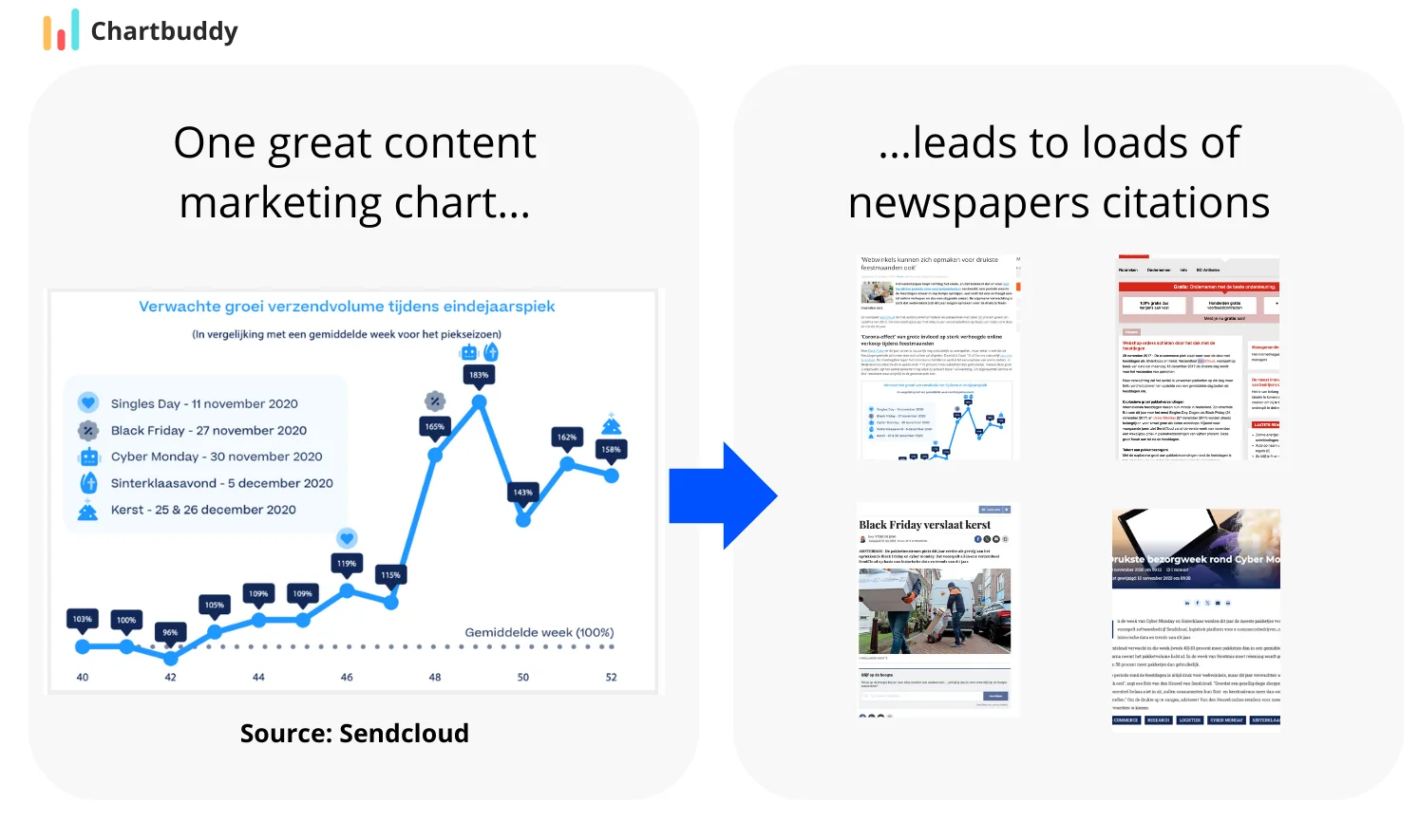
Every year, news paper and branche organizations cite this content, resulting in millions of views. How do they do this?
Takeaway 1: Choose 1 or 2 key insights
Newspapers and branche organizations don't want complicated long messages. They want to pack the message in a short headline that draws attention. So give them that.
Takeaway 2: Use a simple chart
Only use simple charts. Preferably bar and line charts, you can also use pie charts. Don't complicate things with stacked or clustered bar charts. Just show a simple trend.
Takeaway 3: Use your brand colors
Newspapers might not cite your logo, but if your visual has your brand colors, it will be recognizable.
Takeaway 4: Analytical rigor is not that important
Business analysts will tell you that you need to properly define everything in your chart, by defining all your metrics, defining the baseline, etc. You need this to some extent, but not too much. It will clutter your chart and reduce virality. Make sure to always mention the metric though (Are we talking about volume, weight, number of parcels?)
Takeaway 5: Add annotations related to the talk of the day
In the example above, we see that Christmas and Black Friday are mentioned. This will help you get cited, because everybody talks about these topics during that part of the year.
Goal 2: Signalling expertise 🧠
In complex or rapidly-evolving sectors, like engineering and marketing, people are always looking for ways to improve their skills, productivity and knowledge. As a content marketer, you wish to leverage that. Draw potential clients to your product or service by showing your expertise.
Case study: McKinsey
Let's look at a prime example again. This time we look at how McKinsey signals expertise in the field of banking using the financial servicese industry with the annual Global Banking Annual Review.
We cannot show detailed pictures of this report here, but we can show some undetailed thumbnails to give an impression.
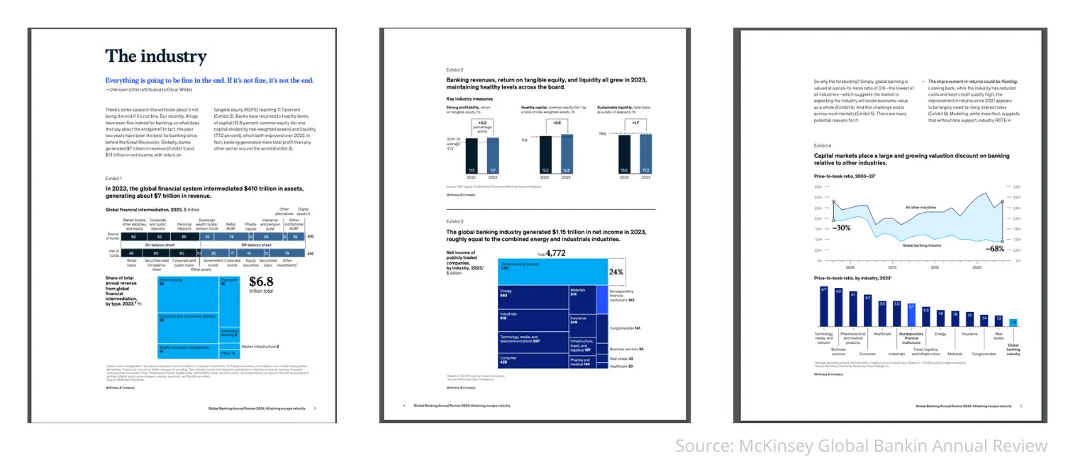
Takeaway 1: Charts can be much more complex when signalling expertise
In this case, banking is complex, multi-faceted and highly evolving. This requires many more charts and details in charts. When signalling expertise through a report, this is more than okay.
Takeaway 2: Be exhaustive
Reports like this tend to include a lot of information. Major companies like McKinsey tend to include a lot more than strictly required. Hardly any banking executive will read it all. But if they look at it at a glance, it will feel like McKinsey has done their homework. So in this context, it's okay to shower your reader with facts. However, there must always be a point to it. Never add information that is not relevant to one of your key insights.
Takeaway 3: Use your brand colors
McKinsey uses their brand colors in their charts and overal content marketing report.
Goal 3: Social media eyeballs 👀
Another possible goal is to get eyeballs on your content. This is often the case for social media content marketing. In this case, we want to grab attention and spark conversations. We wish people to respond to our chart such that the algorithm brings it to more people. Let's have a look at how The New York Times does this.
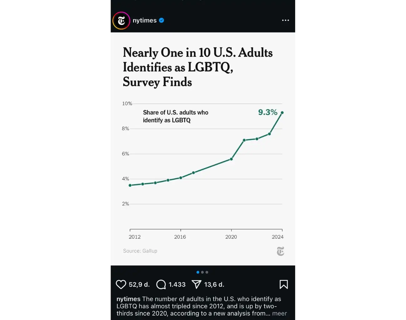
Takeaway 1: Use a simple chart
The Economist uses a simple chart. It's a line chart with a few data points. It's not complex, but it's effective.
Takeaway 2: Use your brand colors
The Economist uses their brand colors in their charts and overal content marketing report.
Takeaway 3: Use annotations
The Economist uses annotations to highlight key insights.
Goal 4: Satisfying direct needs (SEO) 🎯
The goal of content marketing can also be to satisfy the direct needs of your audience. For example:
- A supermarket publishes recipees
- A bank publishes articles on how to save money
- A software vendor publishes articles on to solve some technology problem
Each of these draws in users to their websites, which can then be converted into customers. Often, users go to google to find ansers to their direct needs. So this type of content marketing is very much linked to SEO. The key is to keep focussing on the needs of your audience. The needs are 'eating well', 'saving money' and 'solving a technology problem', not 'food product xyz', 'bank account' and 'software'.
Case Study: Hubspot
Hubspot really champions the 'satisfying direct needs' goal. They publish a lot of content on how to solve marketing problems. Analysis of their content marketing blogs show that charts play a much smaller role in this category of content marketing than in the other three categories. Often, they are more tutorial-focussed rather than insight-focussed. This is okay. Not every content marketing article needs a chart.
To see how they do it, Chartbuddy analyzed 840 of their blog posts.
| 🎯 Marketing | ✍️ Content Creation | 🔧 Technical |
|---|---|---|
| 🚀 Social Media Marketing - Instagram (145) - Facebook (65) - TikTok (40) |
📝 Blogging - Writing Tips (85) - SEO Optimization (95) - Guest Posting (35) |
💻 Web Development - WordPress (110) - HTML/CSS (45) - Performance (40) |
| 📊 Digital Marketing - SEO (120) - Analytics (50) - Lead Generation (55) |
🎥 Visual Content - Video Marketing (45) - Image Optimization (30) - Presentations (25) |
🤖 AI & Technology - AI Tools (50) - Automation (35) - Data Analysis (30) |
| 💼 Business Strategy - Brand Building (40) - Customer Service (35) - Sales (30) |
🌟 Community Building - User Engagement (25) - Customer Loyalty (20) - Forums (15) |
🛠️ Tools & Software - Marketing Tools (35) - Analytics Tools (30) - CRM Systems (20) |
Note: Table total is more than 840 because some posts have multiple categories.
Takeaway 1: Charts are not always needed
Charts are not always needed. Sometimes, a simple text explanation is enough.
Takeaway 2: More is better
For SEO in serving direct needs, more is better. Take every possible angle within every aspect of your customers' needs.
In Summary
Chart Types for Different Goals
| Goal | Content Type | Audience Attention | Chart Types | Colors |
|---|---|---|---|---|
| 📰 Getting cited | 1-3 key insights | Short | Simple bar and line charts that support the message | Strong brand colors for recognition even without logo |
| 🧠 Establishing expertise | Long-form thought leadership | Long | Complex visualizations that support your ideas | Gray + accent for sophistication |
| 👀 Social media engagement | LinkedIn carousels, infographics | Very short | Simple bar and line charts | Brand colors + bright accents to stand out |
| 🎯 Satisfying direct needs | Solution-focused content | Varies by need | Charts that clearly explain solutions | Functional, clarity-focused colors |
Let's explore each of these approaches in detail...
The most visually appealing chart isn't always the best choice. Consider:
- Your message's primary purpose
- Your audience's data literacy
- The complexity of your data
- The platform where it will be shared
Further Reading
For more insights on creating effective charts, explore our guides on emphasis and annotations and color usage.