Color is one of the most powerful tools in data visualization, yet it's often misused. As chart builders, we frequently see users struggle with color choices that either confuse their message or distract from it. Let's explore how to use color effectively, starting with the fundamental principles and moving to practical applications.
1. Why use color in charts?
Color in charts essentially serves one or more of the following purposes:
- To distinguish between categories (like different departments)
- To highlight specific data points
- To maintain brand consistency
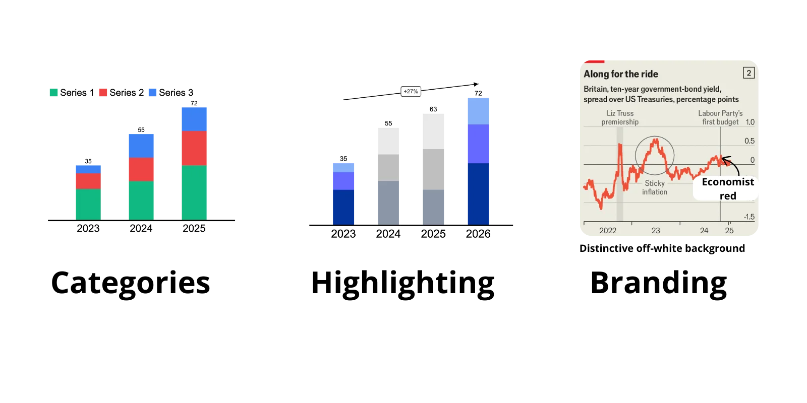
Color purpose 1: Distinguishing Categories
The primary role of color in categorical data is to help viewers instantly differentiate between groups.
- Each region needs its own distinct color
- Colors should have equal visual weight to avoid bias
- Limit to 6-8 categories maximum for effective distinction
For example, when comparing departmental performance, using clearly distinct colors allows viewers to track each department's data effortlessly across different views.
When using color for categories, it's important to keep using the same color coding througout your presentation. The reader will start associating the color with the category. Readers may misinterpret the color if you change it between charts.
Color purpose 2: Highlighting Insights
Strategic color emphasis is perhaps the most powerful way to guide your audience's attention. As McKinsey's data visualization expert Gene Zelazny notes, "Color should work as hard as every other element in your chart. If it's not doing a specific job, it shouldn't be there."
For effective highlighting, we recommend the following:
- Use contrasting colors sparingly
- Draw attention to significant findings by muting everything else
- Maintain visual hierarchy through intentional color choices
- Support the narrative by emphasizing key data points
For example, when presenting sales data across multiple regions, you might gray out all regions except the one you're discussing. This creates an immediate visual focus without removing the context:
Color purpose 3: Branding
Charts are an opportunity to make your branding stand out. Newspaper The Economist does this very well (more on that here: What makes Economist charts so good).

While maintaining brand identity is important, it shouldn't come at the expense of clarity. Many organizations make the mistake of forcing their brand colors into everything even when those colors don't serve the data well. Here's how to balance brand guidelines with effective visualization:
When to Use Brand Colors:
- For highlighted metrics that align with company values
- In customer-facing presentations where brand recognition matters
When to Deviate from Brand Colors:
- When brand colors are too similar and would create confusion
- In complex charts where more distinct colors are needed
- For internal analysis where clarity trumps branding
Smart Brand Color Adaptation
If your brand colors don't work well for data visualization, consider these approaches:
- Use brand colors at different opacities
- Create a supplementary data visualization palette that complements your brand
- Reserve your primary brand color for the most important data points
- Use neutral colors (grays) with brand colors as accents
Remember: The goal is to make your data clear and memorable. As data visualization expert Alberto Cairo puts it, "A chart's first duty is to be useful, not to be branded."
The real reason: All of the above
In practice, effective charts rarely use color for just one of these purposes. Instead, they combine all three:
- Using distinct colors to separate categories
- Employing strategic highlighting to emphasize key points
- Maintaining brand consistency throughout
We recommend you do the same.
2. Choosing Colors
Now that we've established what colors are for, let's focus on which colors to use. The key principle is simplicity: most effective charts rely primarily on variations of a single color, typically your brand color. Let's have a look at how major companies have done this.
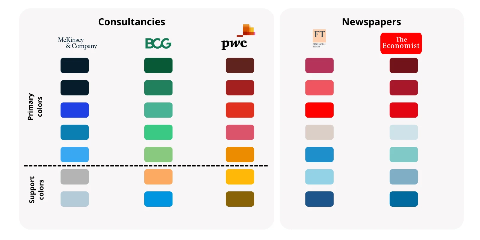
Consultancies
For consulting firms (e.g. BCG, McKinsey and PWC), recognition is very important. Hence they use shades of their brand colors in their charts and slides. Additionally, they use one or two contrasting colors. Shades of a single brand color are simply too similar.
Newspapers
For newspapers, recognition is less important. They don't stick to their brand colors as much. Instead they often opt for two contrasting color palletes. One of these is often in the red spectrum, as this is a useful color to guide the user's attention and signify the negative part of the message.
Your organization
If your organization is neither a consultancy or a newspaper, you might wonder what you should do. Both approaches are valid. If your charts are only used internally, you might want to go with the newspaper approach as being on-brand is less important for internal matters. If your charts/ slides are used externally, you might want to go with the consultancy approach, for better recognition.
Tip
If you're a marketer, include some transparency in your color palette. This will give your charts a more modern look.
3. Applying Colors
Now that we understand what colors are for and which ones to use, let's explore how to apply them effectively in your charts.
Technique 1. Use Gray + Accent
The most versatile approach to color application is what we call the "Gray-Plus-Accent" (or monochrome + accent) technique:
- Start with your entire chart in gray
- Use color only for elements you want to emphasize
- Keep supporting information visible but subdued
This approach works particularly well for:
- Time series comparisons
- Complex datasets
- Presentation slides where you want to guide attention
- Before/after comparisons
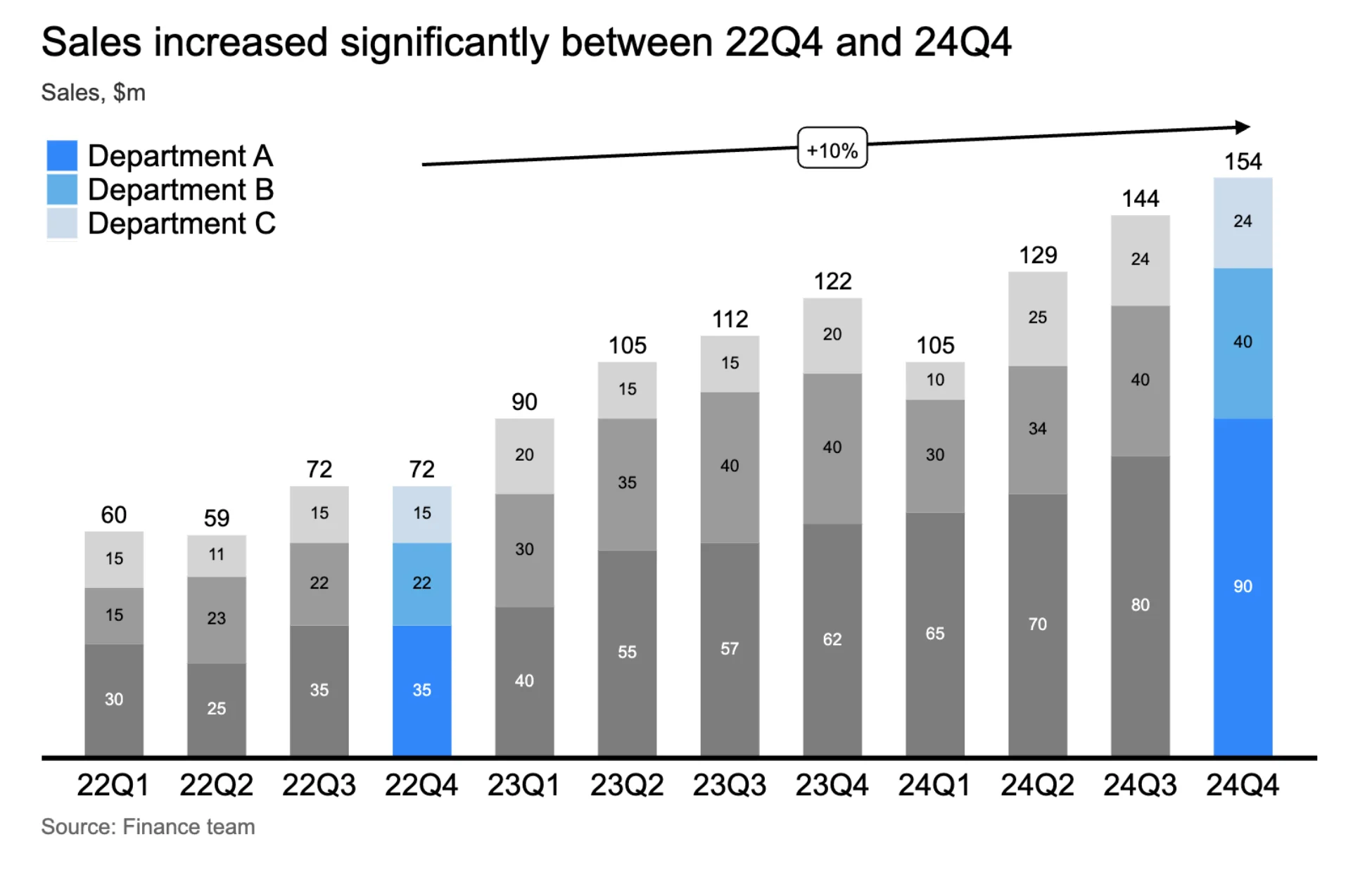
Remember: If everything is highlighted, nothing stands out. As Edward Tufte, the pioneer of data visualization, puts it: "Above all else, show the data." Strategic highlighting helps you do exactly that - it shows the right data at the right time.
Techique 2: Branded shades
The second technique is rather simple. You simply use your brand color in a slightly different shade. This is a great way to make your charts more consistent and recognizable. It doesn't make your message stand out, but it does make your charts more consistent.

Color tips
Tip 1: Color for Annotations
Color is for making your message stand out. And so are annotations! So it makes sense to use color for annotations.
Color isn't just for data-it's also a powerful tool for annotations. When adding explanatory text or callouts to your charts, color can help create clear visual connections. For example:
- Use your accent color for annotation text that references highlighted data
- Match annotation arrow colors to the data they're pointing to
- Create subtle background colors for important note areas
Learn more about effective annotations in our guide on how to annotate charts effectively.
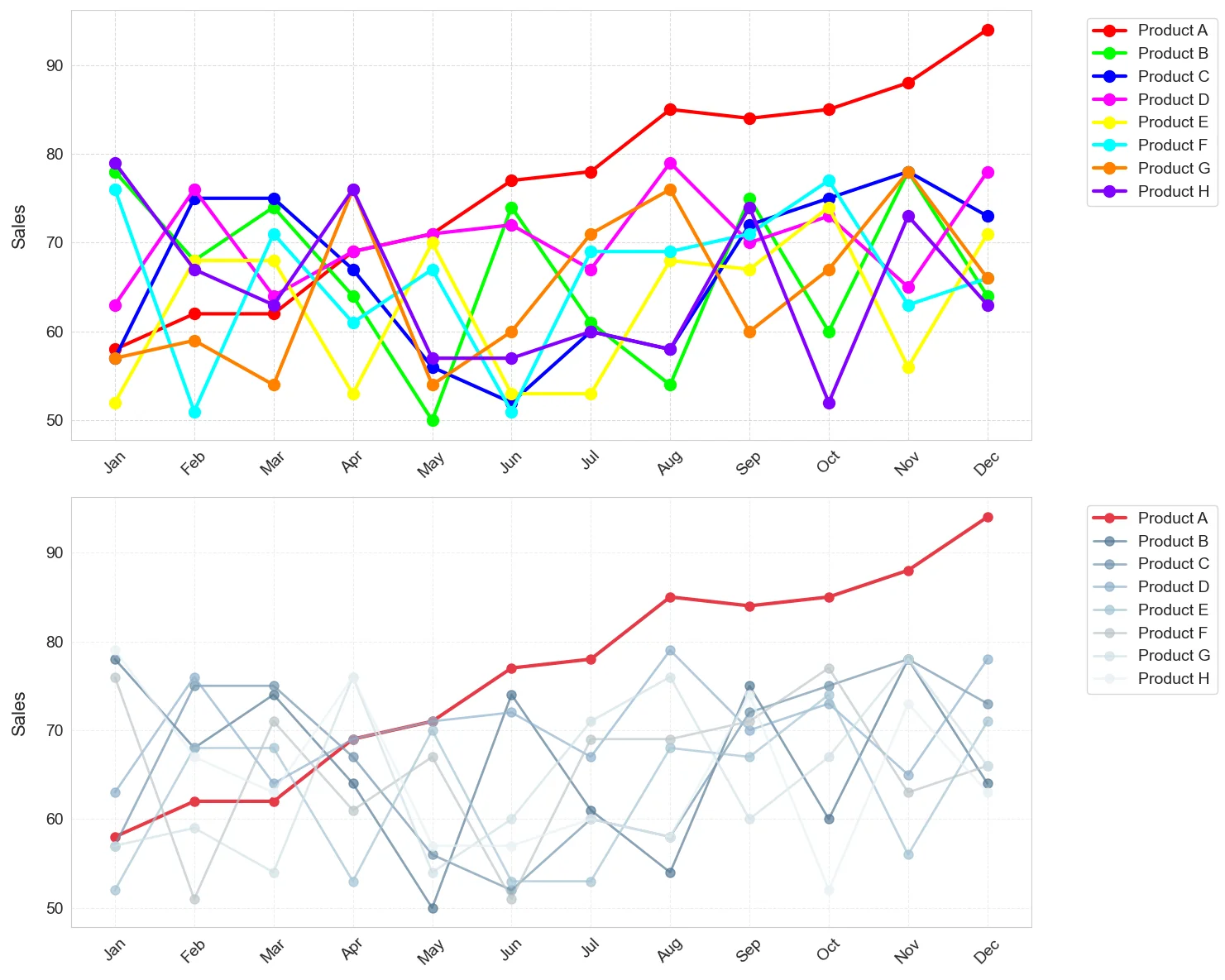
Tip 2: No more than 6-8 categories per chart
We strongly recommend not using more than 6-8 categories per chart. If you find that you need more colors in a chart, likely you're not separating your messages well enough. Remember, try to keep one message per chart. If you do want to include more categories, give the categories that are not key to your message a similar shade. This way your message will stand out more from the noise (see bottom chart).
Further Reading
For more insights on data visualization, check out our guides on chart decluttering and The Economist's visualization principles.