Creating a chart takes less than a minute. There's no fixed order - you can start with data, pick a chart type, or format first. Here's the simplest path.
Step 1: Open Chartbuddy
In any Google Slides presentation, click the Chartbuddy widget in the bottom-right corner of the screen. The Chartbuddy panel opens.
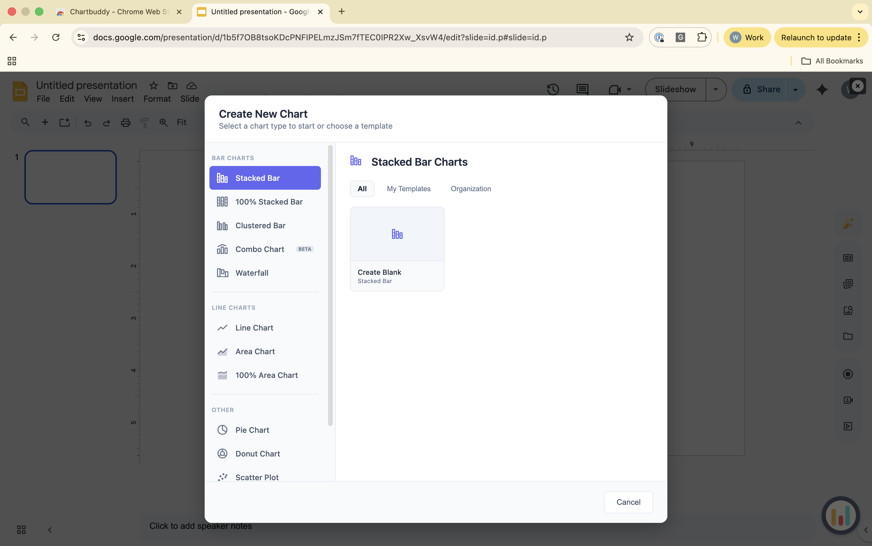
Step 2: Select a chart type
Choose from the chart type menu: bar, stacked bar, clustered bar, 100% bar, line, area, 100% area, waterfall, mekko, scatter, bubble, pie, doughnut, or combo (bar + line). Click the one you want.
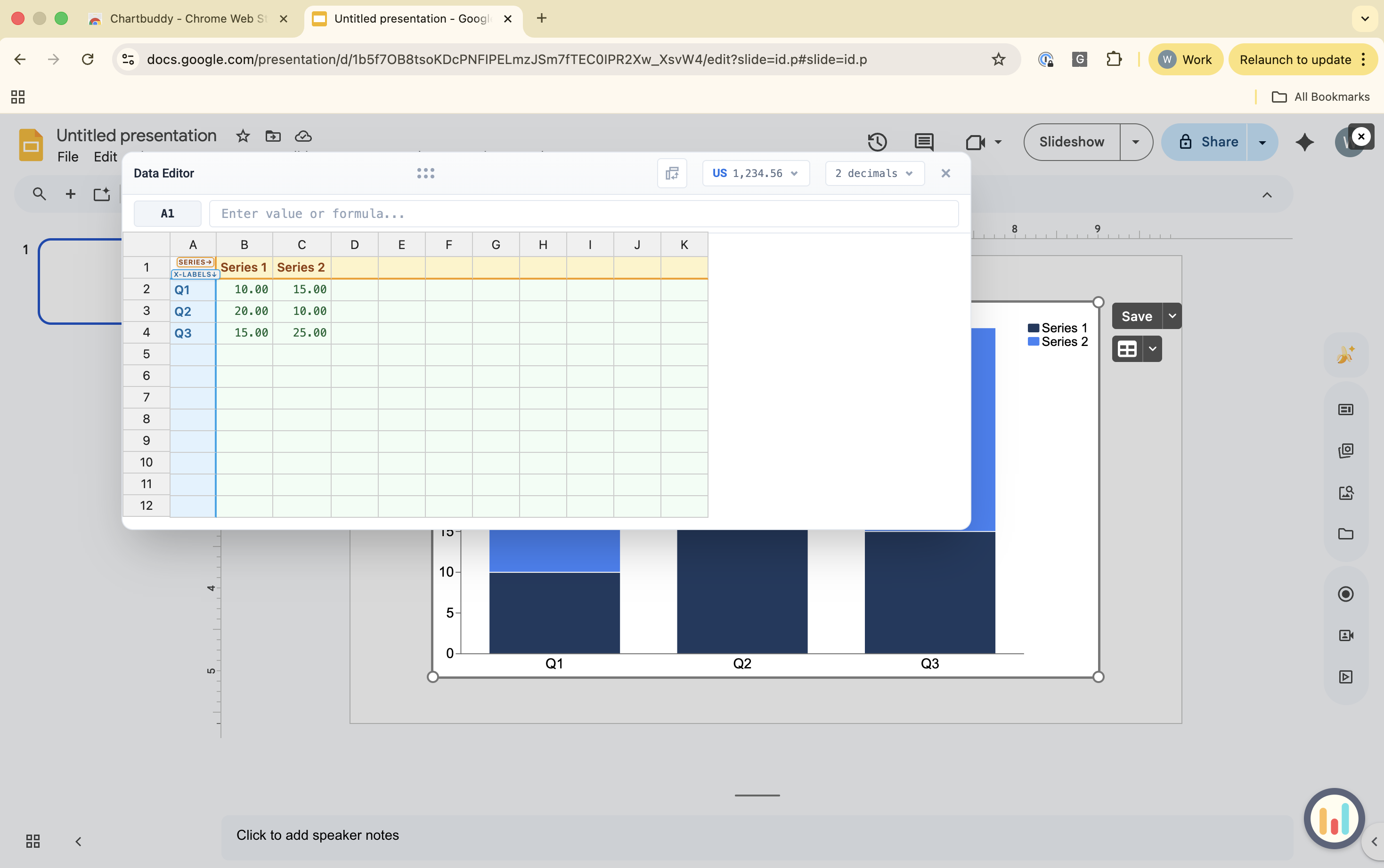
Step 3: Enter or link your data
You can type data directly into Chartbuddy's data editor, or link a Google Sheets range to pull data automatically. See How to connect a chart to Google Sheets for the full walkthrough.
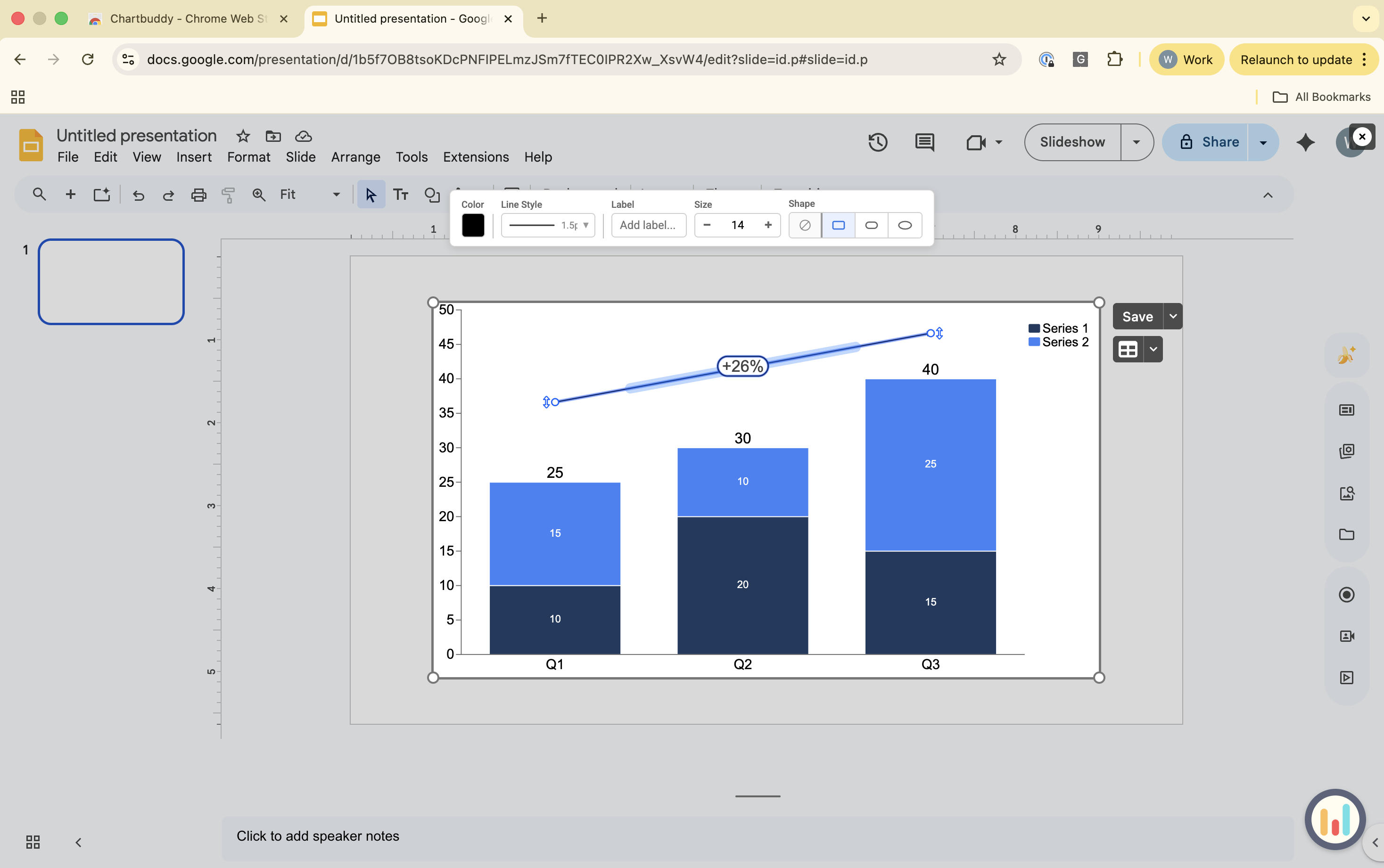
Step 4: Customize your chart
Right-click on any element to insert or show titles, axes, data labels, annotations, CAGR indicators, level arrows, call-outs, and more. Every element has extensive formatting options in the top bar. Changes update the chart on your slide in real time.
Step 5: Done
Your chart is now a native element on your slide. Click on it anytime to edit. Anyone with Chartbuddy installed can edit the chart; viewers without Chartbuddy see a static image.