How to customize charts in Google Sheets (complete guide with examples).
Want to make your Google Sheets charts look more professional and engaging? Whether you're creating presentations, reports, or dashboards, knowing how to customize charts in Google Sheets is essential for effective data visualization. This comprehensive guide will show you everything from basic formatting to advanced customization techniques.
Customization in Google sheets
Chart Title
- Editing the Title: Click on the chart title to edit it. Type in a descriptive title that accurately reflects the data being presented. For example, "Monthly Sales Performance" or "Product Sales Comparison."
- Font and Style: You can change the font, size, and style of the title to match your document's theme. To do this, click on the title, then use the formatting options in the Chart Editor.

Tips:
- Make the title clear and concise.
- Use a font style that is easy to read.
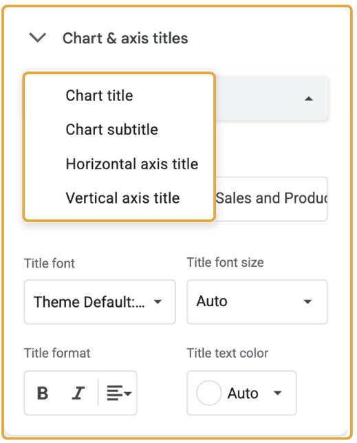
Axis Titles
- Adding Axis Titles: Axis titles provide context for the data on the horizontal and vertical axes. To add or edit axis titles, go to the Customize tab in the Chart Editor, then select Chart & Axis Titles. Enter your titles in the provided fields.
- Formatting Axis Titles: Similar to the chart title, you can customize the font, size, and style of the axis titles.
Tips:
- Use descriptive titles that explain what each axis represents (e.g., "Month" for the horizontal axis and "Sales ($)" for the vertical axis).
- Ensure the titles are legible and appropriately sized.
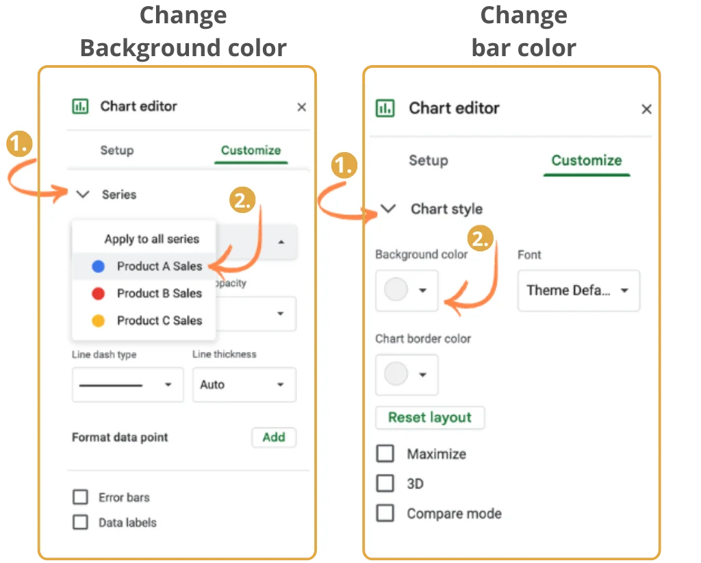
Colors and Chart Style
- Changing Bar Colors: You can change the colors of the bars to make your chart more visually appealing. In the Customize tab, select Series. Here, you can choose different colors for each data series.
- Background Color: Change the background color of the chart to match your document's theme. This option is available under Chart Style in the Customize tab.
- Border Color: You can add or change the border color of the chart to make it stand out.
Tips:
- Use contrasting colors to differentiate between data series.
- Choose colors that are visually appealing and easy to distinguish.
- Choose a background color that complements the colors of the bars.
- Use a border color that enhances the overall appearance of the chart.
Want help with the Color usage? Check out the guide to using colors in charts.
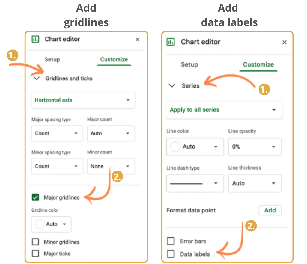
Gridlines and Labels
- Adjusting Gridlines: Gridlines help readers interpret the values on the chart. You can add or remove gridlines by going to the Customize tab and selecting Gridlines and Ticks. Adjust the major and minor gridlines as needed.
- Adding Data Labels: Data labels display the exact values on the bars. To add data labels, go to the Customize tab, select Series, and check the box for Data Labels. You can customize the position and format of the labels.
Tips:
- Use gridlines to enhance readability without cluttering the chart.
- Data labels should be clear and positioned in a way that does not overlap with the bars.
Line Styles
Line graphs allow unique style customizations, including:
- Changing the line thickness to make lines more prominent or subtle.
- Adding dashed or dotted styles to distinguish between multiple lines on the same graph.
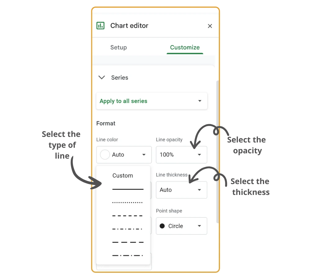
- Open the Chart Editor and navigate to Customize → Series.
- Adjust the line thickness: Use the Line Width dropdown to make lines bold (for emphasis) or subtle (for clarity in busy graphs).
- Change the line dash style: Select from solid, dashed, or dotted styles to distinguish between datasets effectively.
Tips:
- Use a thicker line for your primary dataset to draw more attention to it.
- Experiment with dashed or dotted styles for secondary datasets to differentiate them without overwhelming the graph.
Data Point Markers
Line graphs can display precise values for each individual data point, making it easier to interpret specific trends along the timeline or X-axis.
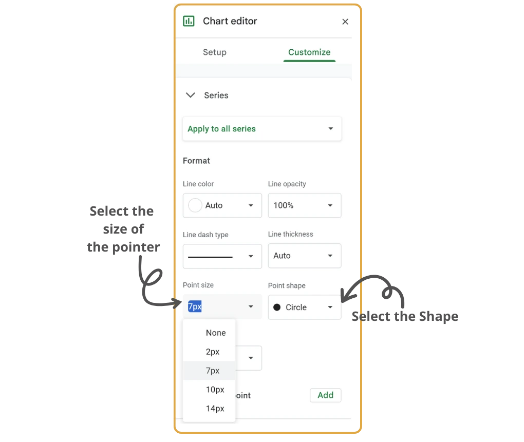
- In the Chart Editor, go to Customize → Series.
- Enable data point markers: Under Point Style, activate markers for your dataset to highlight each data point along the line. Choose from a variety of marker shapes (e.g., circles, squares) depending on your preferred style.
- Customize the size of the markers to make data points clearer and stand out visually.
Tips:
- Use markers for data points when you want to highlight exact values or significant points.
- Avoid overly large markers that could make the graph look cluttered.
Trendlines
Trendlines help visualize the overall direction or pattern of the data. You can add different types of trendlines:
- Linear: For a straight-line trend
- Exponential, Polynomial, or Moving Average: For more complex patterns
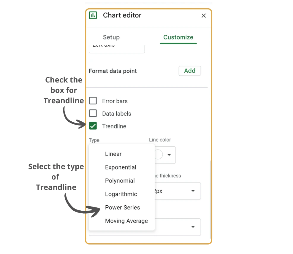
- Navigate to Customize → Series in the Chart Editor.
- Enable trendlines by checking the box for Trendline.
- Select a trendline type based on your data.
- Fine-tune the trendline:
- Change the color to make it distinct from the original line graph.
- Adjust the thickness for emphasis.
Tips:
- Use trendlines to help viewers quickly identify the direction or pattern in your data.
- Adjust the trendline color to contrast with the primary lines, making it clear and noticeable.
Final Tips
- Keep your charts clean and uncluttered.
- Use colors that are easy to differentiate.
- Always label your axes and data series.
- Test different chart types to find what best communicates your data story.
Best Practices for Chart Customization
- Maintain consistency across all charts in your spreadsheet
- Use color blindness-friendly palettes
- Keep designs simple and clean
- Ensure text is readable at different zoom levels
- Test your charts on different devices and screen sizes
Conclusion
With these customization options, you can transform basic charts into professional, easy-to-read visuals that clearly tell the story behind your data. Remember that the goal of customization is not just to make your charts look better, but to make them more effective at communicating your data insights.